This case study is best viewed on desktop.If you're wondering why...let's just say I'm prioritizing other things.If you're on your phone seeing this, respectfully, leave now before you burn your eyes.Redesigning LinkedIn’s Save Feature
to Easily Access Your Saved Content
Redesigned how users access and act on their saved content on LinkedIn (web), making it easier to navigate, prioritize, and take strategic action on saved posts.
Company
Client Zero (personal)
Year
2026
Role
Product Designer
Tools
Figma Make, Bolt.new
Platform
Web Application
Timeframe
3 days
Category
Social
Focus
UX/UI Design, Rapid Prototyping, Vibe Coding
The Problem
LinkedIn users save posts, articles, and jobs with a clear intention: to come back to them. But the saved content experience buries everything in a single, undifferentiated list. There's no way to sort by type, prioritize what matters now, or take action directly from the saved view.
The result: saved content becomes a graveyard. Good intentions, no follow-through. Not because users don't care, but because the interface doesn't support the action they came to take.
The Approach
I used bolt.new to initiate this concept back in July 2025. I was originally going to use this as my ELVTR Course capstone project, but I changed my mind. So during the Meet & Make with Figma Make event in February, I decided last minute to use this project for the event. This is where I used Figma Make to move from concept to testable prototype in a single session. The goal was to validate the interaction model quickly, not polish a mock.
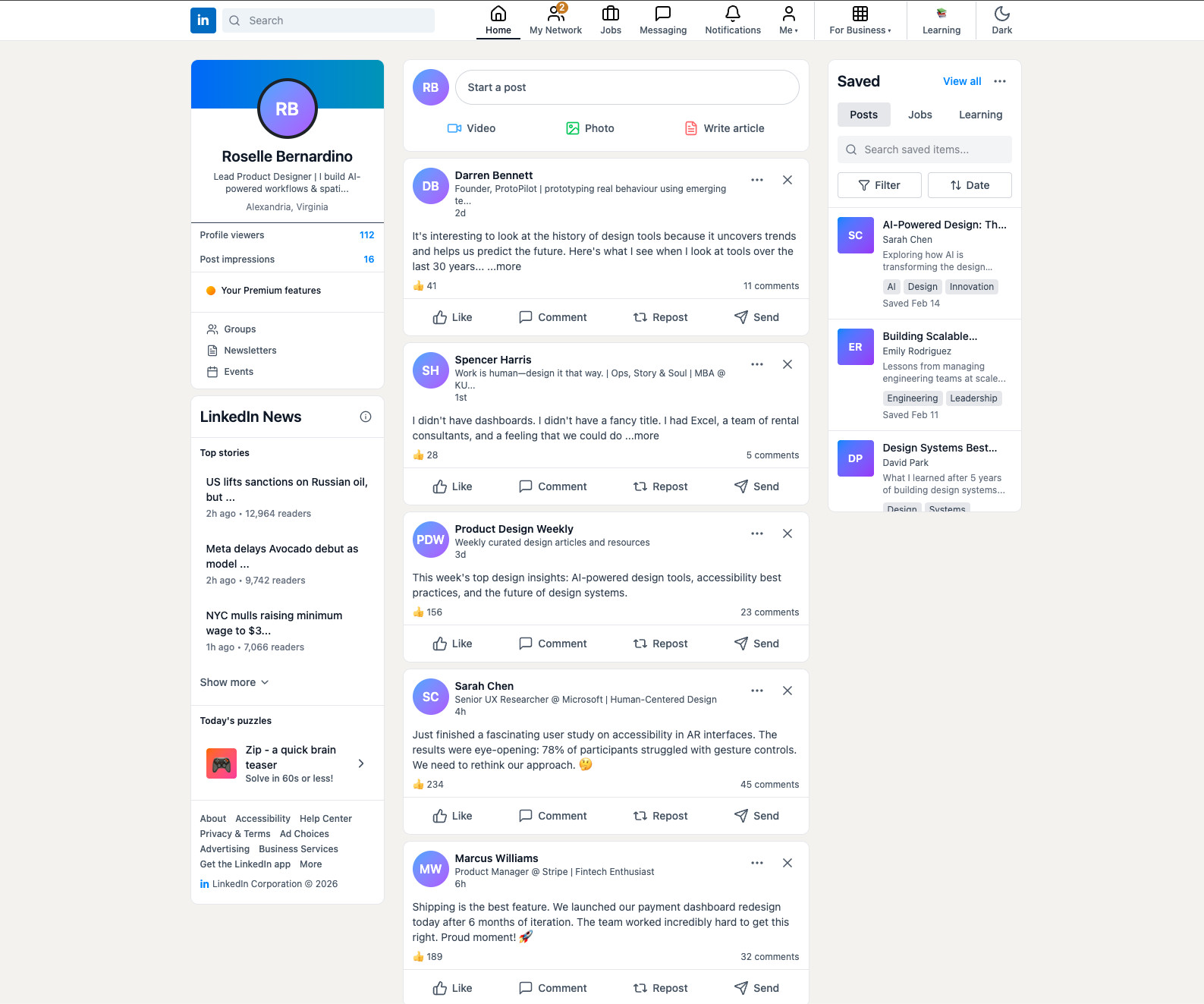
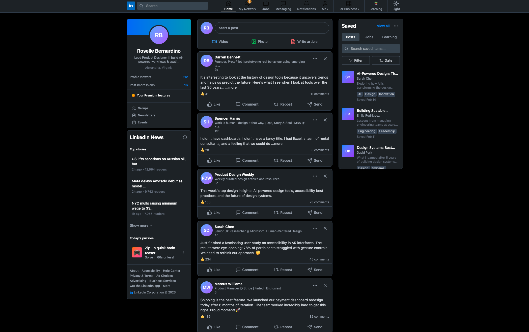
Screenshot I used for reference in Figma Make. Prompt: Using LinkedIn's interface, replace the Promoted section with the Saved Section. User has the option to tab through saved posts, jobs, or Learning videos, ability to filter, sort, and tag saved items, and search with a search bar.(Left) Bolt.new version done in July 2025. (Right) Figma Make version.Key Design Decisions
Decision 1: Separate saved content by type.
The current experience mixes posts, articles, jobs, and events into one flat list. I designed a tabbed structure that lets users switch context intentionally. If you're in job-search mode, you don't want to wade through thought leadership posts to find your saved job listings.
Saved Posts - BeforeSaved Posts - AfterDecision 2: Surface action affordances directly.
Each saved item in the redesign shows contextually relevant actions inline: "Apply," "Share," "Schedule a reminder," "Mark as done," depending on item type. The action is the point of returning to saved content. The interface should make that obvious.
Posts will have in-line actions depending on the type of saved item.Decision 3: Add a recency and relevance signal.
Items saved 6 months ago and never acted on are not the same as items saved yesterday. I added a lightweight staleness indicator and a "resurface" mechanic for items that matched current active job searches or topics the user was engaging with.
Other design decisions made after the event.The Result
The redesign was selected for presentation at the Figma DC Community Meetup, which meant pressure-testing the design narrative in front of other designers, not just a client or course reviewer. The feedback confirmed the core interaction model worked. The main pushback: the tabbed structure added navigation overhead for users with small saved libraries. A progressive disclosure approach (tabs appearing only once a certain volume threshold is reached) was the direction I'd explore next.
Click the image below to try the prototype!
Reflection
This project reinforced something I keep coming back to: saving is an act of intention, and good design should honor that intention rather than just archive it. The saved content experience is a re-engagement surface, not a storage bucket. Designing it that way changes every decision downstream.
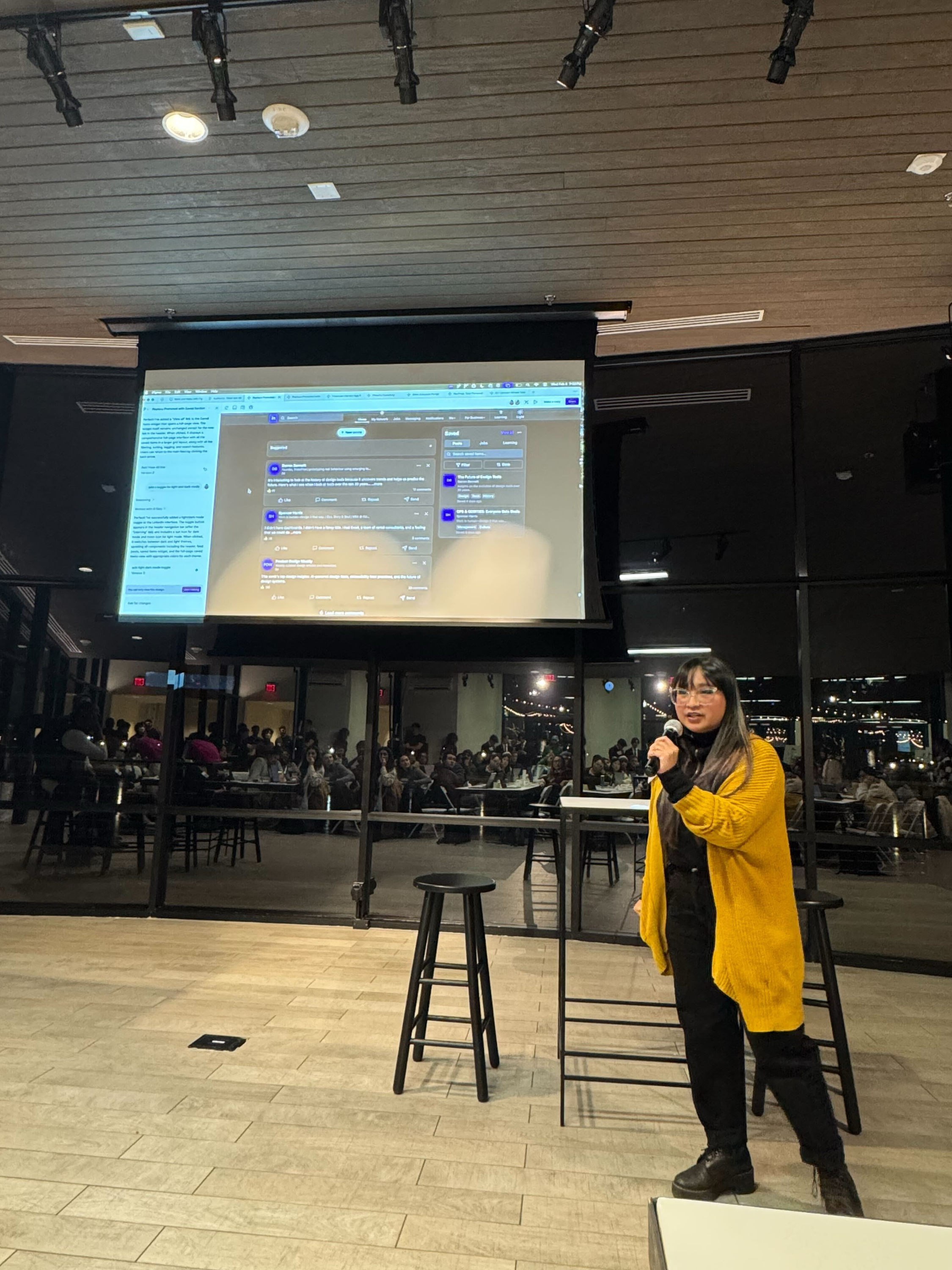
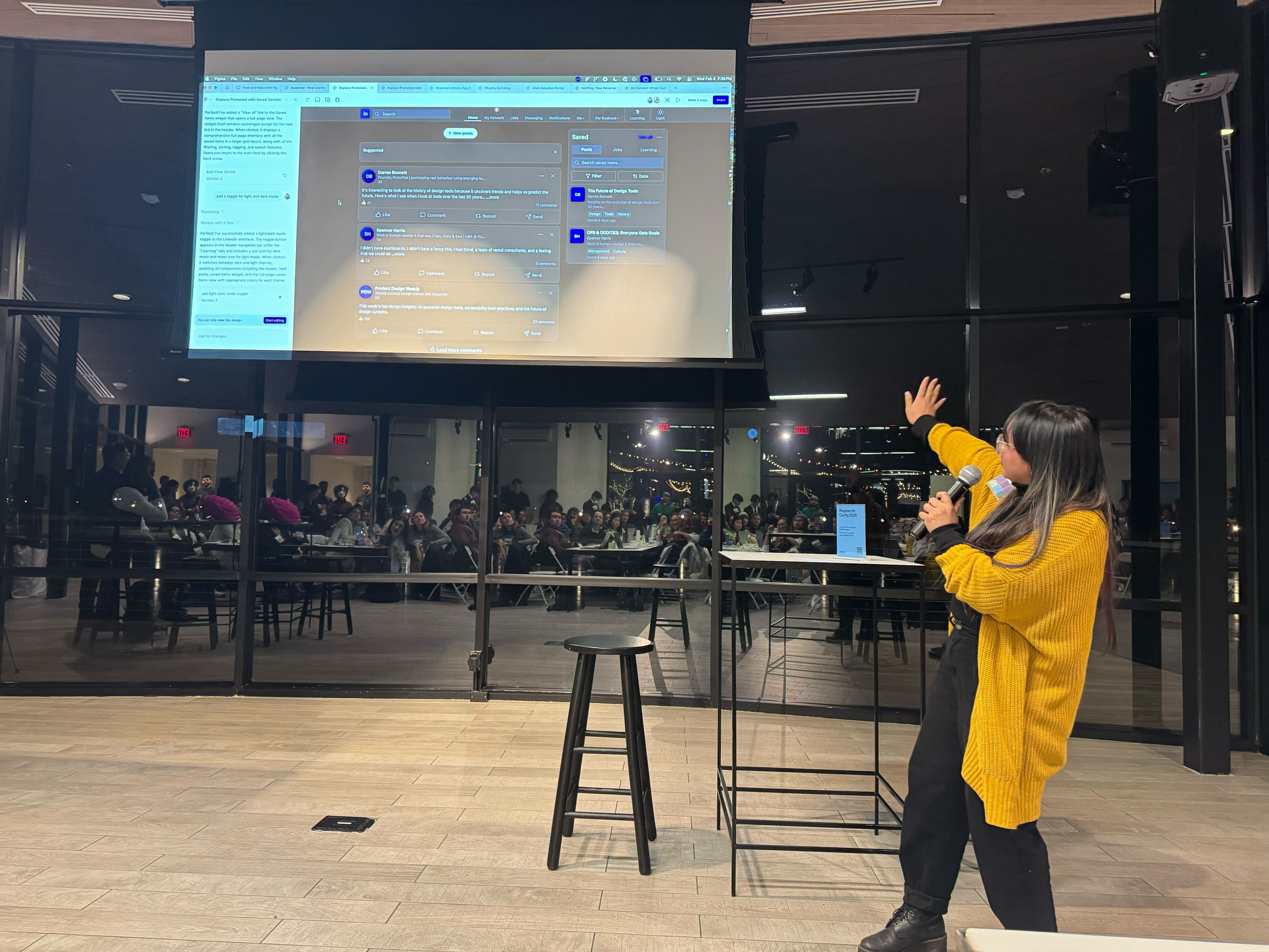
Presenting my design at the DC Figma Make Community Event February 4, 2026. Photo by Susan Jung.